 | drawing and painting |
Silverlight supports vector graphics by providing the Ellipse, Rectangle, Line, Polyline, Polygon, and Path elements. Collectively, these elements are known as the shape elements.
This document contains the following sections
basic shapes
Silverlight provides three basic shape elements: Ellipse, Rectangle, and Line.
- An Ellipse element describes an oval or circle. You control its horizontal diameter by setting its Width property, and its vertical diameter by setting its Height property.
- A Rectangle element describes a square or rectangle shape, optionally with rounded corners. You control its horizontal size by setting its Width property and its vertical size by setting its Height property. You can also use the RadiusX and RadiusY properties to control the curvature of its corners.
- Instead of using Width and Height, you control the size and location of a Line by setting its X1,Y1, X2, and Y2 properties.
The following example draws an Ellipse, a Rectangle, and a Line in a Canvas.
[hide XAML]
<Canvas
    xmlns="http://schemas.microsoft.com/client/2007"
    xmlns:x="http://schemas.microsoft.com/winfx/2006/xaml">
  <Ellipse Height="200" Width="200" Canvas.Left="30" Canvas.Top="30"
      Stroke="Black" StrokeThickness="10" Fill="SlateBlue"/>
  <Rectangle Height="100" Width="100" Canvas.Left="5" Canvas.Top="5"
      Stroke="Black" StrokeThickness="10" Fill="SlateBlue"/>
  <Line X1="280" Y1="10" X2="10" Y2="280"
      Stroke="black" StrokeThickness="5"/>
</Canvas>
[hide] [restart]
other shape elements
In addition to the Ellipse, Line, and Rectangle elements, Silverlight provides three other shape elements: Polygon, Polyline, and Path. A Polygon is a closed shape with an arbitrary number of sides, while a Polyline is a series of connected lines that might or might not form a closed shape. The following example creates a Polygon and a Polyline.
[hide XAML]
<Canvas
   xmlns="http://schemas.microsoft.com/client/2007"
   xmlns:x="http://schemas.microsoft.com/winfx/2006/xaml">
  <Polyline Points="150, 150 150, 250 250, 250 250, 150"
      Stroke="Black" StrokeThickness="10"/>
  <Polygon Points="10,10 10,110 110,110 110,10"
      Stroke="Black" StrokeThickness="10" Fill="LightBlue"/>
</Canvas>
[hide] [restart]
The Path element can be used to represent complex shapes that include curves and arcs. To use a Path element, you use a special type of attribute syntax to set its Data property. The following example creates three Path elements.
[hide XAML]
<Canvas
   xmlns="http://schemas.microsoft.com/client/2007"
   xmlns:x="http://schemas.microsoft.com/winfx/2006/xaml">
  <Path Data="M0,0 L11.5,0 11.5,30 5.75,40 0,30z"
      Stroke="Black" Fill="SlateBlue"
      Canvas.Left="10" Canvas.Top="10" />

  <Path Data="M 10,100 C 10,300 300,-200 250,100z"
      Stroke="Red" Fill="Orange"
      Canvas.Left="10" Canvas.Top="10" />

  <Path Data="M 0,200 L100,200 50,50z"
      Stroke="Black" Fill="Gray"
      Canvas.Left="150" Canvas.Top="70" />


</Canvas>
[hide] [restart]
For more information about path markup syntax, see Path Markup Syntax in the Silverlight SDK.
painting shapes with brushes
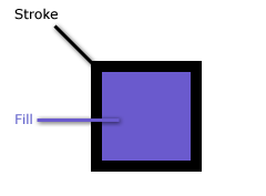
Most shapes consist of two parts, a stroke (the outline) and a fill which are controllable through their Stroke and Fill properties. The following illustration labels the stroke and fill of the Rectangle from the first example.
Not every shape has both a fill and a stroke: A Line has only a stroke. Setting the Fill property of a Line has no effect.
You set a shape's Stroke and Fill with a Brush. There are 4 types of brush objects that you can use:
- SolidColorBrush
- LinearGradientBrush
- RadialGradientBrush
- ImageBrush
- VideoBrush (Described in the media topic )
painting with solid colors with a SolidColorBrush
To paint an area a solid color, you use a SolidColorBrush. XAML provides several ways to create a SolidColorBrush.
- You can use attribute syntax to specify the name of a color, such as
"Black"or"Gray". - You can
use attribute syntax with hexadecimal notation to describe the red, green, and blue values of a
color, and optionally its transparency. There are several formats you can use.
- 6-digit notation. The format is
#rrggbb, where rr is a two-digit hexadecimal value that describes the amount of red in the color, gg describes the amount of green, and bb describes the amount of blue. For example,#0033FF. - 8-digit notation. The format is the same as 6-digit notation, except with
two extra values for describing the alpha value, or opacity, of the color:
#aarrggbb. For example,#990033FF.
- 6-digit notation. The format is
- You can use object element syntax to explicitly create a SolidColorBrush and set its Color property.
The following example shows several ways to paint an object black.
[hide XAML]
<Canvas
    xmlns="http://schemas.microsoft.com/client/2007"
    xmlns:x="http://schemas.microsoft.com/winfx/2006/xaml">

  <Ellipse Height="90" Width="90" Canvas.Left="10" Canvas.Top="10"
      Fill="black"/> <!-- SolidColorBrush by color name. -->

  <Ellipse Height="90" Width="90" Canvas.Left="110" Canvas.Top="10"
      Fill="#000000"/> <!-- SolidColorBrush by 6-digit hexadecimal notation. -->

  <Ellipse Height="90" Width="90" Canvas.Left="10" Canvas.Top="110"
      Fill="#ff000000"/> <!-- SolidColorBrush by 8-digit hexadecimal notation. -->

  <Ellipse Height="90" Width="90" Canvas.Left="110" Canvas.Top="110">
    <Ellipse.Fill>

      <!-- SolidColorBrush by object element syntax. -->
      <SolidColorBrush Color="Black"/>
    </Ellipse.Fill>
  </Ellipse>
</Canvas>
[hide] [restart]
painting with gradients with LinearGradientBrush and RadialGradientBrush
Silverlight supports both linear and radial gradients. Gradients have one or more gradients stops that describe the different colors that the gradient transitions between and the location of those colors. Most gradients only need two gradients stops, but you can add as many gradients stops as you need.
- LinearGradientBrush paints a gradient along a line. This line is diagonal by default and stretches from the upper-left corner to the lower-right corner of the painted object. You can use the StartPoint and EndPoint properties to change the position of the line.
- RadialGradientBrush paints a gradient along a circle. By default, the circle is centered on the area being painted. You can customize the gradient by setting its GradientOrigin, Center, RadiusX, and RadiusY properties.
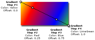
To add gradient stops to a gradient brush, you create GradientStop objects. Set the Offset property of a GradientStop to a value between 0 and 1 to set its relative position in the gradient. Set the Color property of the GradientStop to a named color or a hexadecimal value.
The following example uses LinearGradientBrush and RadialGradientBrush objects to paint four Rectangle objects.
[hide XAML]
<Canvas
   xmlns="http://schemas.microsoft.com/client/2007"
   xmlns:x="http://schemas.microsoft.com/winfx/2006/xaml">

  <!-- Linear gradients -->
  <Rectangle Width="140" Height="70" Canvas.Left="10" Canvas.Top="10">
    <Rectangle.Fill>
      <LinearGradientBrush>
        <GradientStop Color="Yellow" Offset="0.0" />
        <GradientStop Color="Red" Offset="0.25" />
        <GradientStop Color="Blue" Offset="0.75" />
        <GradientStop Color="LimeGreen" Offset="1.0" />
      </LinearGradientBrush>
    </Rectangle.Fill>
  </Rectangle>

  <Rectangle Width="140" Height="70" Canvas.Left="155" Canvas.Top="10">
    <Rectangle.Fill>
      <LinearGradientBrush  StartPoint="0,0" EndPoint="1,0">
        <GradientStop Color="Yellow" Offset="0.0" />
        <GradientStop Color="Red" Offset="0.25" />
        <GradientStop Color="Blue" Offset="0.75" />
        <GradientStop Color="LimeGreen" Offset="1.0" />
      </LinearGradientBrush>
    </Rectangle.Fill>
  </Rectangle>

  <!-- Radial gradients -->
  <Rectangle Width="140" Height="70" Canvas.Left="10" Canvas.Top="110">
    <Rectangle.Fill>
      <RadialGradientBrush>
        <GradientStop Color="Yellow" Offset="0.0" />
        <GradientStop Color="Red" Offset="0.25" />
        <GradientStop Color="Blue" Offset="0.75" />
        <GradientStop Color="LimeGreen" Offset="1.0" />
      </RadialGradientBrush>
    </Rectangle.Fill>
  </Rectangle>

  <Rectangle Width="140" Height="70" Canvas.Left="155" Canvas.Top="110">
    <Rectangle.Fill>
      <RadialGradientBrush GradientOrigin="1,0">
        <GradientStop Color="Yellow" Offset="0.0" />
        <GradientStop Color="Red" Offset="0.25" />
        <GradientStop Color="Blue" Offset="0.75" />
        <GradientStop Color="LimeGreen" Offset="1.0" />
      </RadialGradientBrush>
    </Rectangle.Fill>
  </Rectangle>
</Canvas>
[hide] [restart]
You can also use gradients to paint a shape's Stroke.
The following illustration highlights the gradient stops of the first LinearGradientBrush from the previous example.
painting with images using ImageBrush
Another type brush is ImageBrush. By default, the image is stretched to fill the entire shape, but you can use the Stretch property to control how the brush stretches its image. The following example uses two ImageBrush objects with different Stretch settings to paint two Rectangle objects.
[hide XAML]
<Canvas Width="300" Height="300"
   xmlns="http://schemas.microsoft.com/client/2007"
   xmlns:x="http://schemas.microsoft.com/winfx/2006/xaml"
   Background="White">

  <Rectangle Height="180" Width="90" Canvas.Left="10" Canvas.Top="10"
      Stroke="Black" StrokeThickness="1">
    <Rectangle.Fill>
      <ImageBrush ImageSource="star.png"/>
    </Rectangle.Fill>
  </Rectangle>

  <Rectangle Height="180" Width="90" Canvas.Left="110" Canvas.Top="10"
      Stroke="Black" StrokeThickness="1">
    <Rectangle.Fill>
      <ImageBrush ImageSource="star.png" Stretch="Uniform"/>
    </Rectangle.Fill>
  </Rectangle>
</Canvas>
[hide] [restart]
what's next
Like all UI elements, shape elements can be scaled, rotated, or translated by using their RenderTransform property. For more information, see the next topic, common graphics properties.
Copyright © 2007 Microsoft Corporation. All rights reserved. Legal Notices.